Our image
evolves
We are an organisation committed to our values, and our brand is a reflection of who we are and how we work. Our image evolves, but always maintains the same purpose: helping the world understand itself better.
To accompany us in this brand redesign we worked with Costa, a team we connected with from the very first moment thanks to their way of listening, understanding and building together. Their experience in the technology sector helped us translate what we already were—our origins, our culture and our way of working—into a clearer and more current identity, keeping the essence intact: imaxin helps the world understand itself better, with intelligence in dialogue.
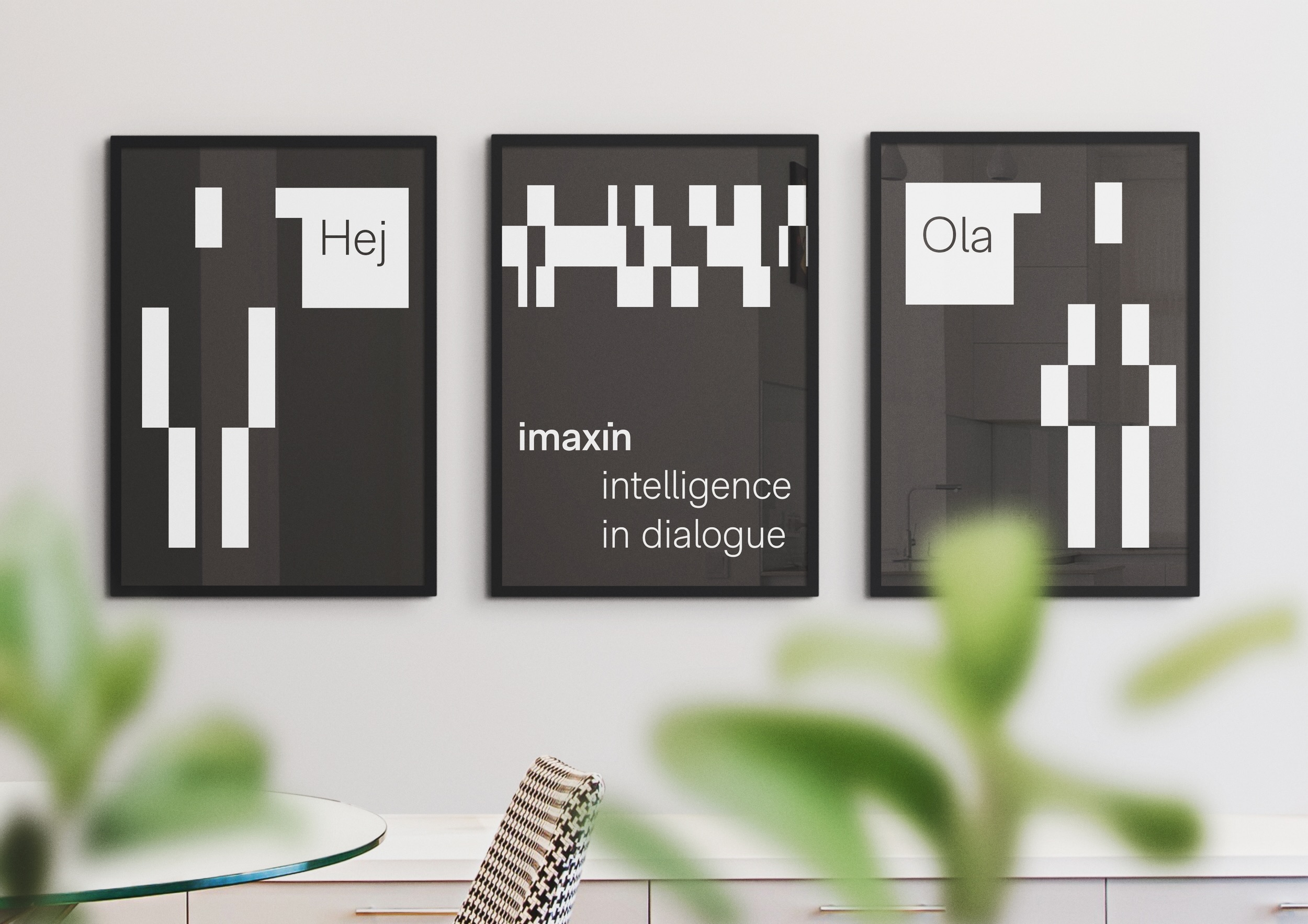
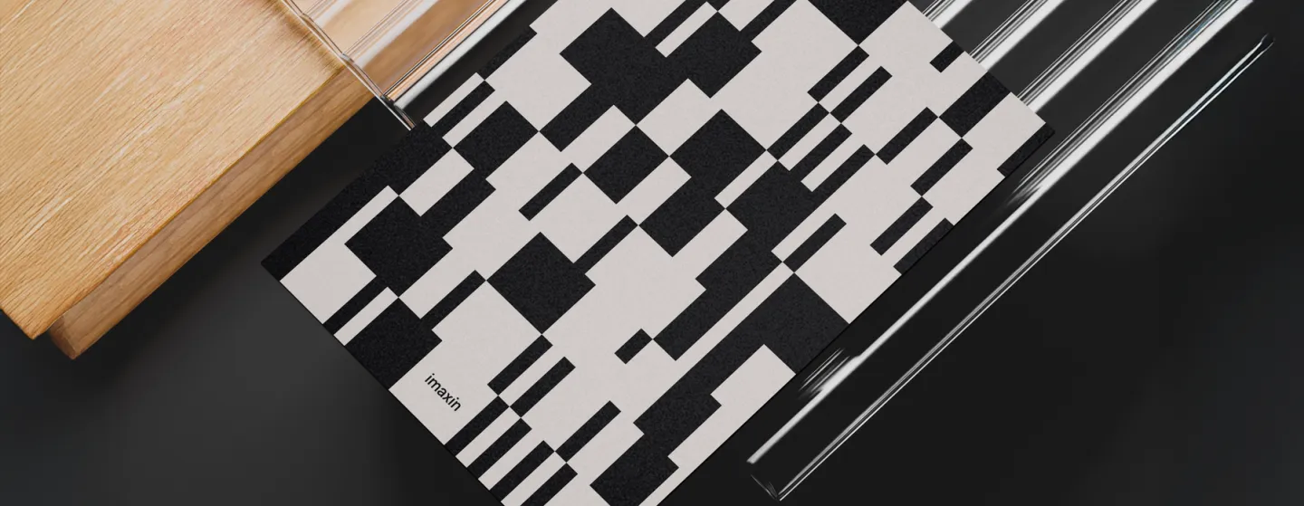
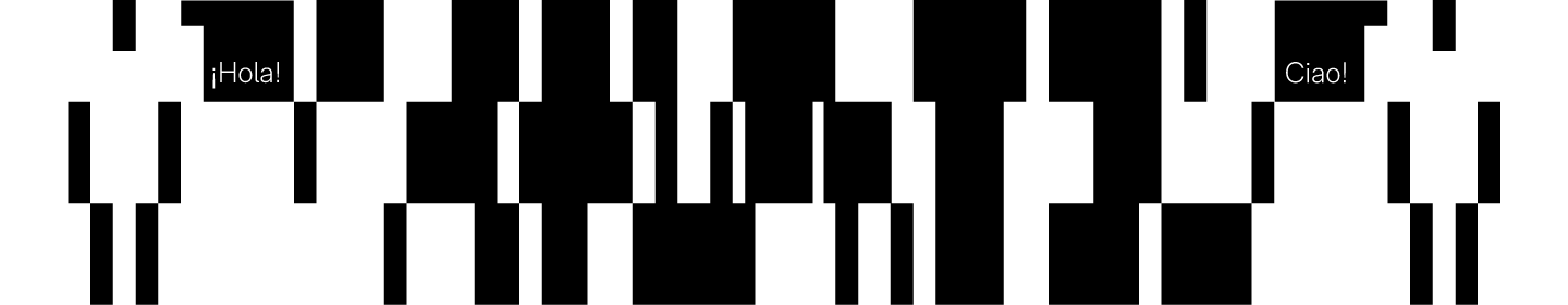
The imaxin identifier is based on the company's own name, written in the corporate typeface in semibold and adjusted to the grid created from the "i". This typographic construction becomes the visual axis of the brand and gives coherence to its different versions and applications.
Company
overview
imaxin is a technology company specialised in language technologies and applied artificial intelligence. With over 25 years of experience, it develops solutions for machine translation, natural language processing (NLP), linguistic quality correction and evaluation, anonymisation and dataset creation, as well as web development and educational application development.
It works with public administrations, media organisations and companies operating in multilingual environments, with an ethical, responsible and quality-focused approach.
Its purpose is clear: helping the world understand itself better.

Correct use of the identifier
These are the guidelines on safe zones and minimum size for correct use of the identifier.
Define height

Define width
The minimum reproduction size is 45 px wide in digital formats and 7.5 mm in print.

Primary colours
Black and white are the primary colours, guaranteeing the highest possible contrast for good legibility. They are chosen in their purest forms, maintaining this parallelism with binary code.
Black

CMYK: 0/0/0/100
RGB: 0/0/0
HEX: #000000
PMS: Black 6 C
RAL: 9005
White

CMYK: 0/0/0/0
RGB: 255/255/255
HEX: #FFFFFF
PMS: Bright White
RAL: 9003
Secondary colours
These colours are used only as complements to the above, to generate backgrounds or create hierarchies. They represent the process of going from 0 to 1, as something intermediate must exist between the two values—in this case, greys.
Dark grey (black complement)

CMYK: 0/0/0/90
RGB: 51/51/51
HEX: #333333
PMS: Black 7 C
RAL: 9004
Light grey (white complement)

CMYK: 0/0/0/20
RGB: 230/230/230
HEX: #E6E6E6
PMS: 427 C
RAL: 7047
Person,
more than a symbol
The human figure that accompanies our image represents dialogue and understanding, concepts at the heart of our purpose: developing software that connects through language. It is a genderless figure, one in which everyone can feel represented, because it symbolises what we have in common—what unites us.
imaxin seeks natural understanding and has no hesitation in opening up its knowledge or its code, because the value of its work lies in its human dimension.